Case K-AI
The artificial intelligence team at K-group does a great job building intelligence in every industry that the corporation operates in. The highly professional team needed help to establish a clear brand to gain better exposure for the important work they do.
Roles: Designer & Front End Developer
Time: 2017
Tools:
How it started
The starting point for building the new identity for the artificial intelligence team was to clarify the vision and the bigger picture of the artificial intelligence work at K-group. A clear brand definitely needs a crystal-clear vision in order to be successful.
I started the design process with my dear colleague Hanna-Reetta Luukkainen with a couple of workshops involving all the team members to really sharpen the idea behind the AI-work.
We used post-it methods, were everybody wrote their ideas and had the opportunity to speak their minds democratically.
After the insights from the workshops, we began to write a story behind the brand and started thinking about the name.
We found a somewhat obvious name for the brand after some heavy brainstorming and silly ideas: K-AI. Other options were K-Aino, K-Aivo and K-Aima and so forth.
Visual identity and the logo
After the name was decided I started working on the visual identity and the logo. I soon got an idea of creating a techy circuit board vector pattern and somehow involve it in the forthcoming logo.
After creating the pattern by using a creative commons circuit image which I vectorized and tweaked, I started to find ways to unite it with the companys "K"-letter to get the consistency with other brands that K-group has.
I wanted the visual identity to radiate "the feeling of coding with an eye-friendly dark background" so I created a visual rule for the new logo: it could only appear on a dark background.
The AI-team really loved the prososal for the new visual identity so I fine tuned the logo, created circuit-like patterns and a color palette to finalize the work. We then showcased the new brand internally and set the sails for new AI-era in K-group.
Here's the final logo, color palette and the patterns:

The Exhibition
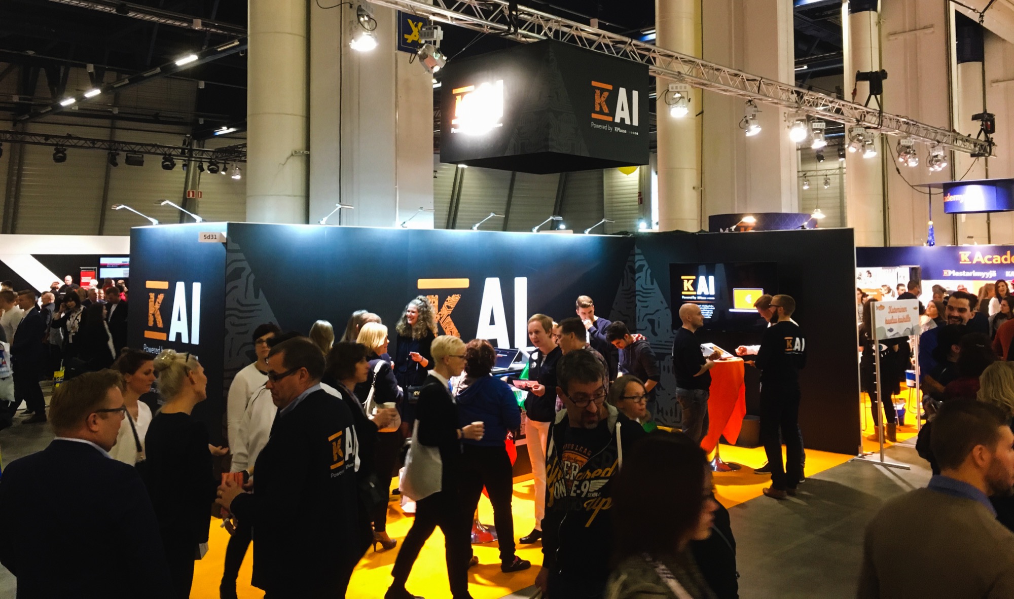
One thing led to another and soon after we launched the new K-AI brand, the management wanted K-AI to be the main attraction of our departments exhibiton area in K-group's annual K-Team Days.
I started to visualize the exhibition area and designed all the walls and elements for the area. The area also had a big-ass screen, so I used Adobe After Effects to create an animated info video for it. The exhibiton constructions were made by the talented guys from Visuaalinen Pinta Oy.
The crew working in the K-Team Days needed some unifying clothing as well, so we ordered some pretty cool bomber jackets (from the sustainable brand Neutral) with the K-AI logo on the back, which you can see in the photos below.
Web app for the K-Team Days
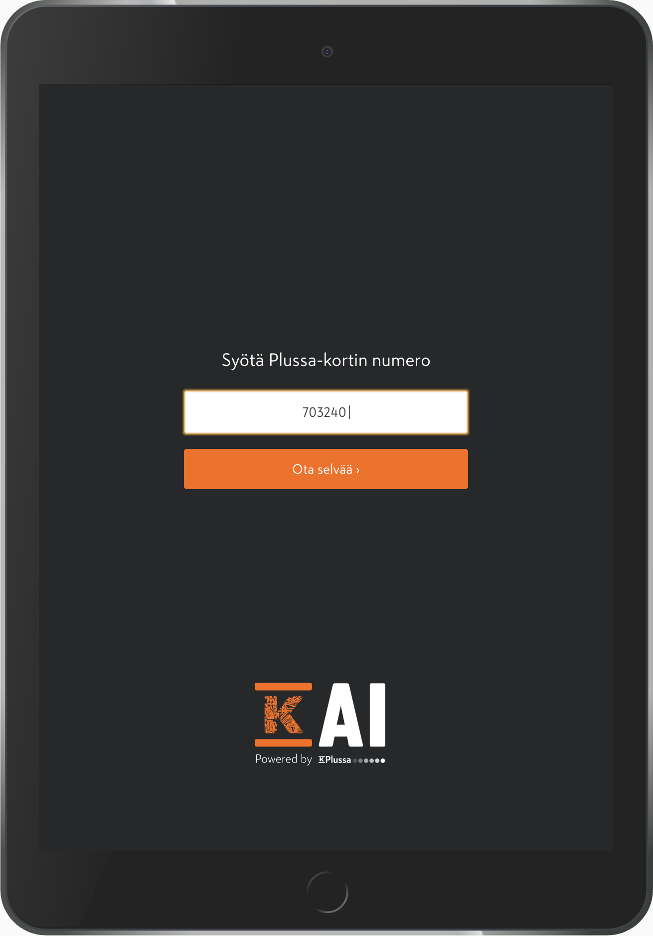
The main attraction in the exhibition area was a playful web app that we ideated and created with the K-AI team.
I designed and coded the web app for iPad in collaboration with the K-AI developer André Schumacher and Data Scientist Niilo Latva-Pukkila.
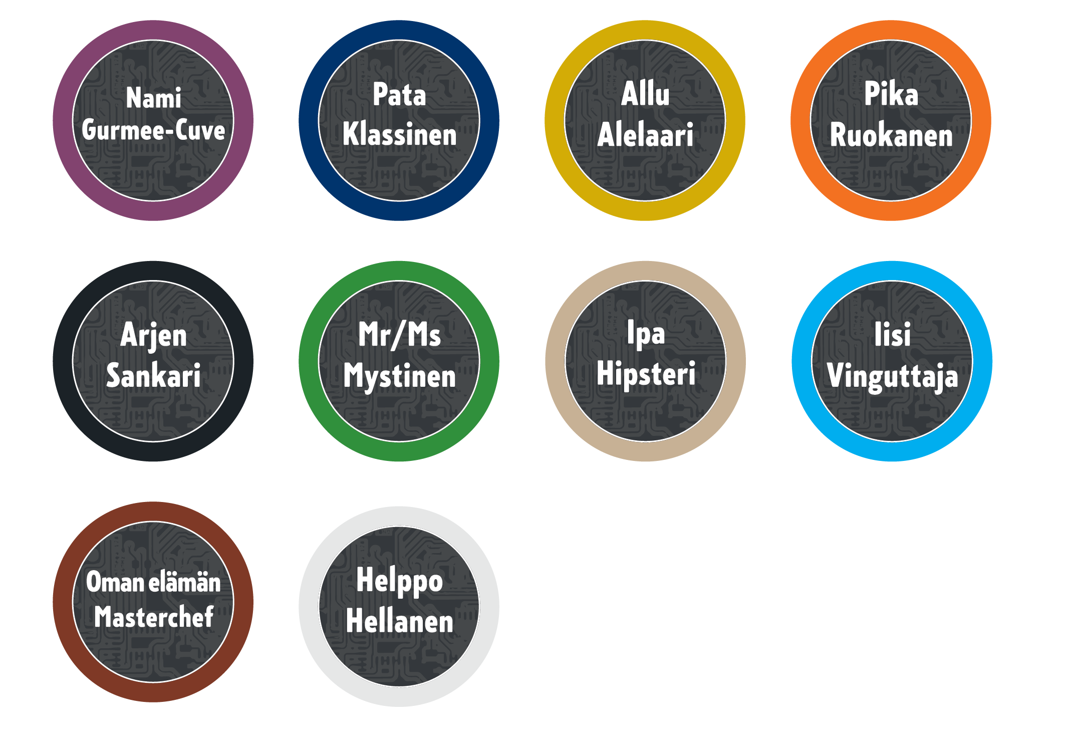
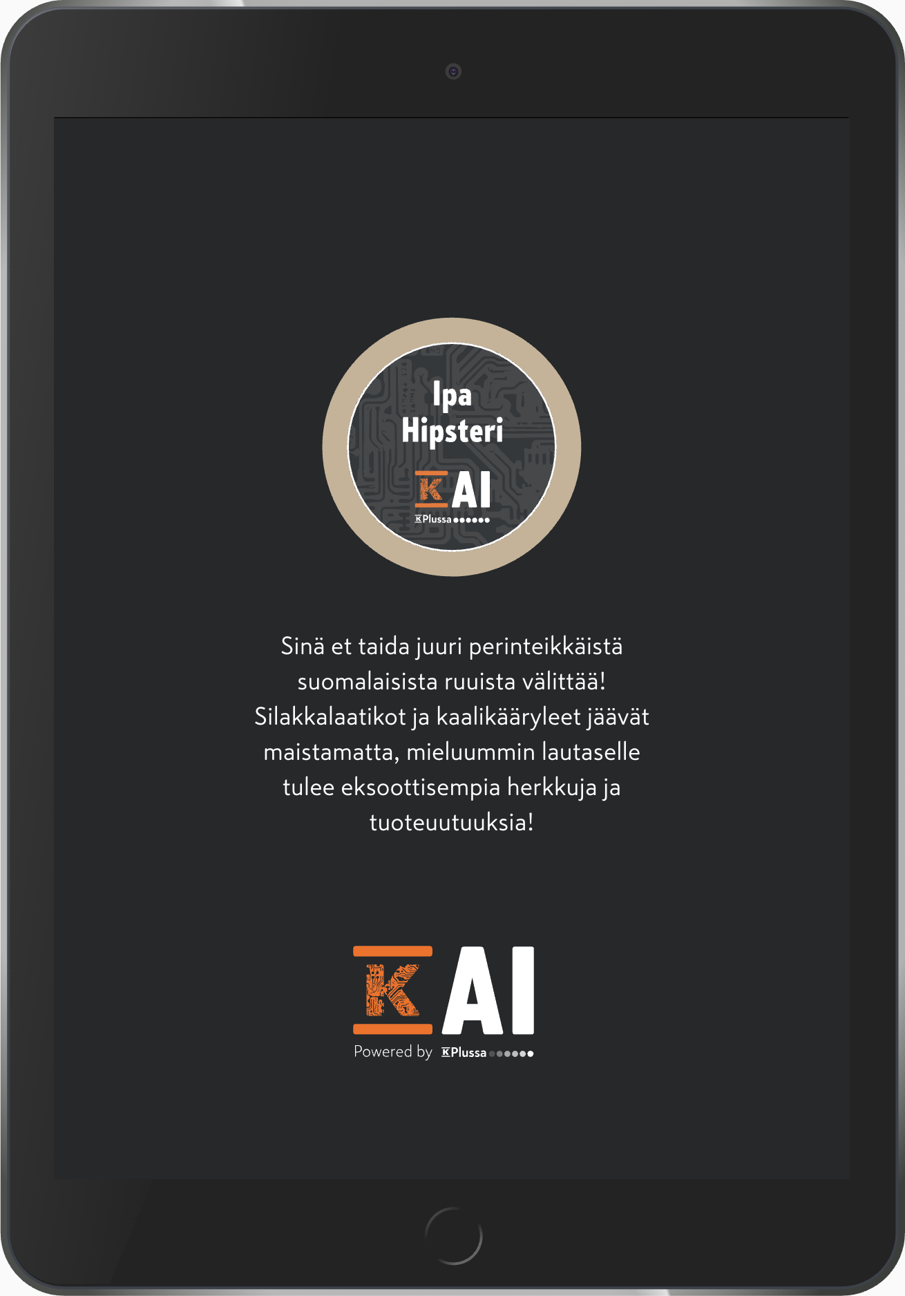
The people attending the exhibition could easily find out in which segment they belong to in the K-Plussa registry based on their grocery shopping data.
The segment was really the one that they have in the K-Plussa registry, but it was brought out in a funny and cheerful manner.
Visitors just typed their K-Plussa loyalty card number and got an instant feedback on what segment they belonged to. After that, the visitors got a sticker badge of their own playful segment.
The app worked like a charm, people were excited about it and we got a lot of good in-house publicity from it.
Here are all the stickers for the different segments that you could belong to: