K-Ruoka is the biggest food media and online grocery store in Finland. It's a home for over 8 000 tested recipes, countless articles and four different brands: K-Supermarket, K-Citymarket, K-Market and Neste K which have over 1 000 stores across Finland.
I joined the team to unify the user experience and support K-Ruoka in the journey to become the very best online grocery store in Finland. I took part in designing both the web service and the native mobile app.
Role: Senior Product Designer
Time: 2018 – 2020
Awards: Grand One 2020 - Best online service
Tools:
tests User
interviews
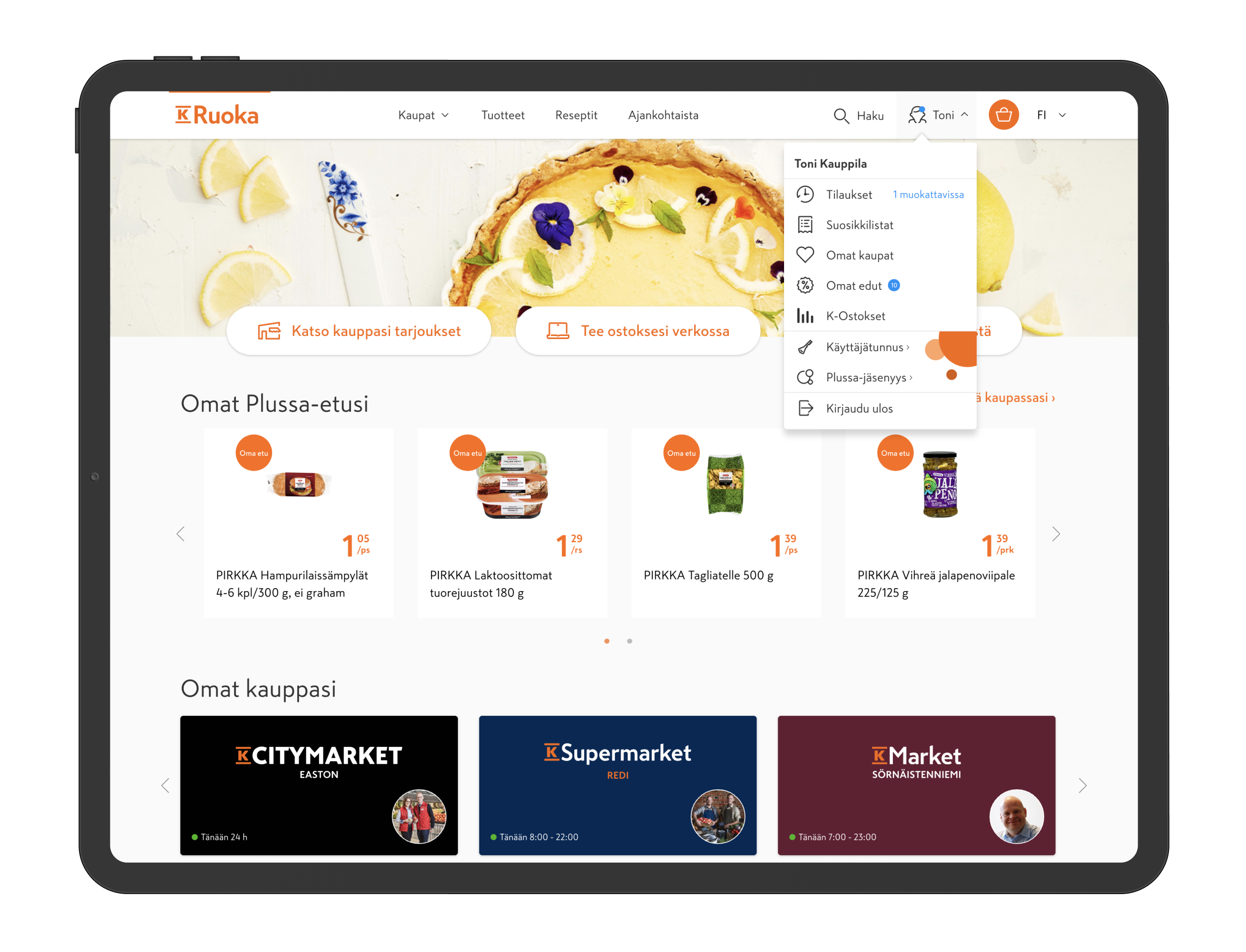
New main navigation and front page
We had to integrate all the grocery chains under K-Ruoka.fi, so the main navigation and the site structure had to be revisited.
The former front page didn't really have a proper structure or any personalized content, so we re-designed it to better match the user's needs. We also wanted to empasize what K-Ruoka.fi is about, since we integrated numerous web pages under one umbrella.
Mobile navigation
At the same time we also updated the mobile navigation to represent the new K-Ruoka.fi and designed a site wide search.
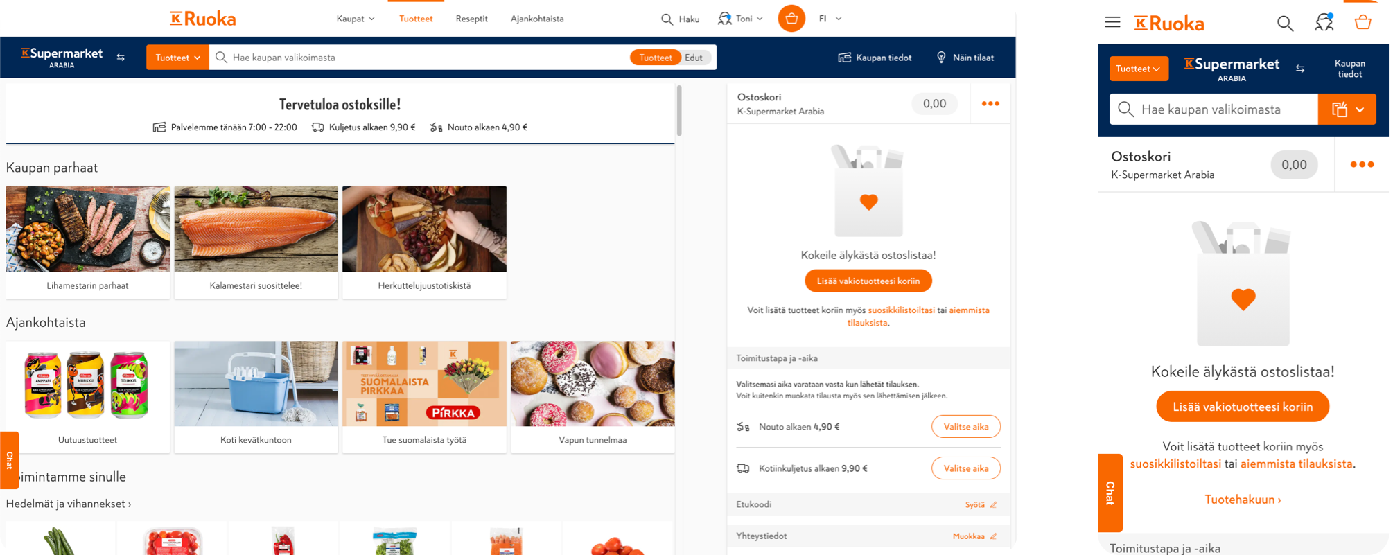
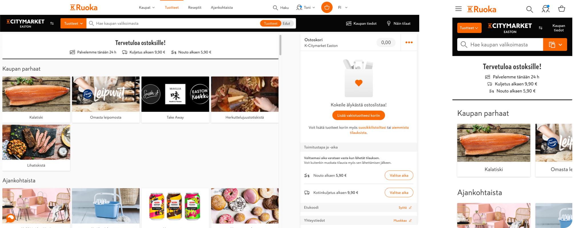
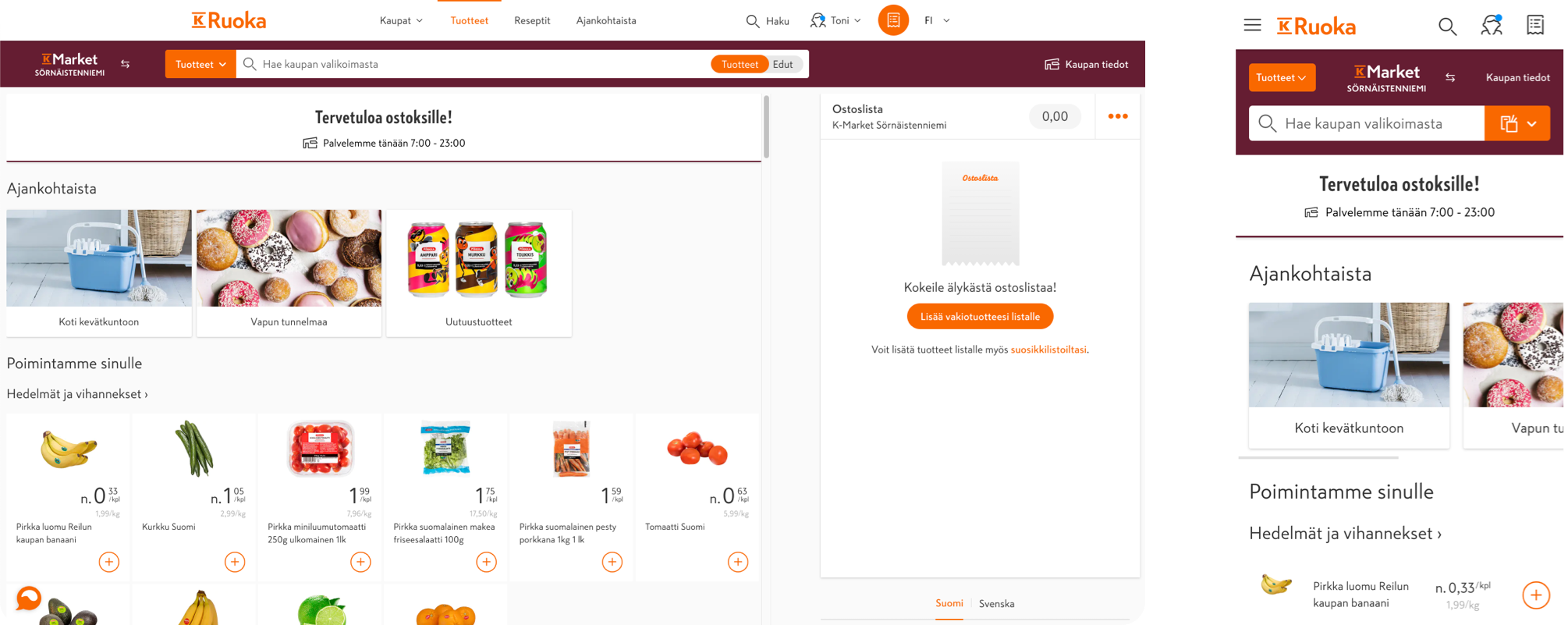
Secondary navigation for all the grocery chains
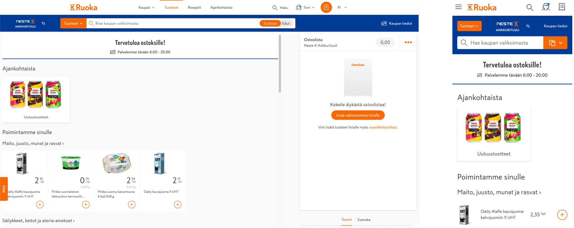
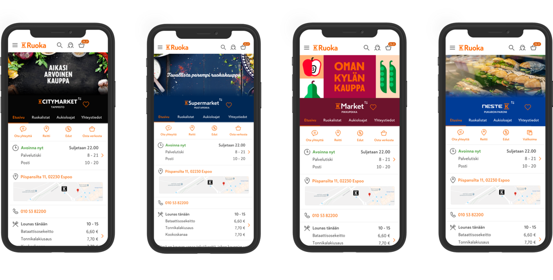
The online grocery section of K-Ruoka.fi used to have an orange secondary navigation for all the chains, but we wanted to separate the chains visually to bring the brand experience to the online world as well.
New sites for individual grocery stores
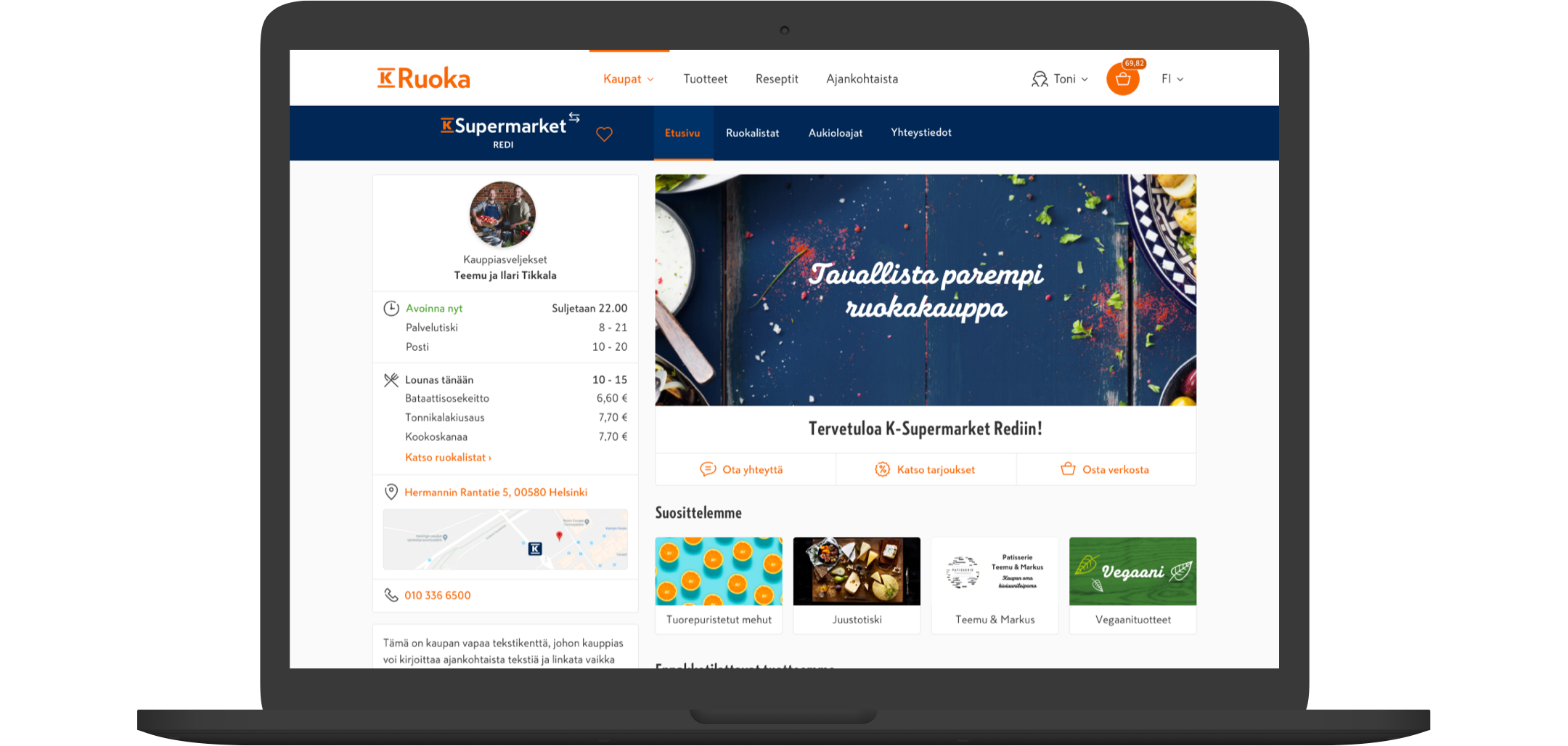
The old grocery store sites only had the very basic info about the stores. The new design was made in contribution with the merchants, chain managers and validated with customers via Maze.
At the same time I took part in designing the internal tool for the merchants to manage their own sites. The internal tool made it easier to manage opening hours, custom notifications, basic information and menus of the in-store restaurants and café's.
Product card: Grocery
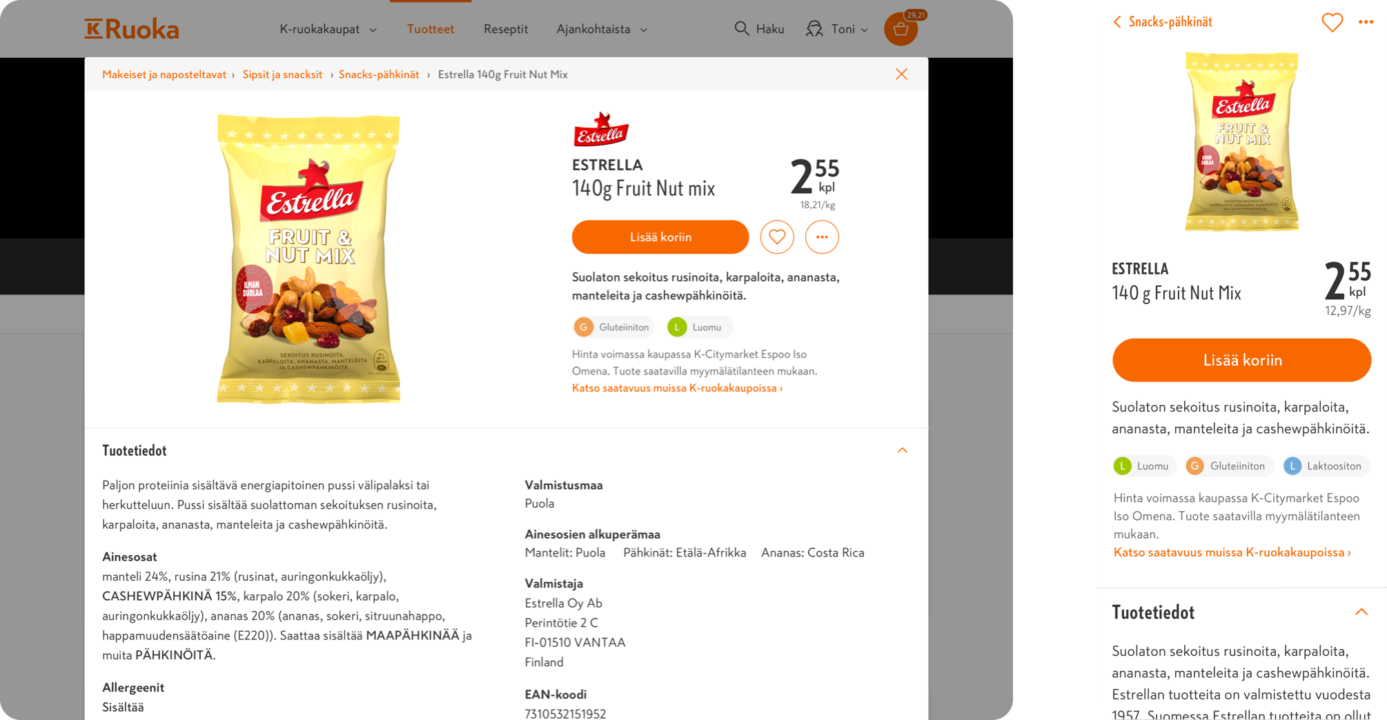
The product card was initially just a small sidebar in the listing view, integrated with the shopping basket, but to make the experience more immersive, we designed it as a modal and full page view.
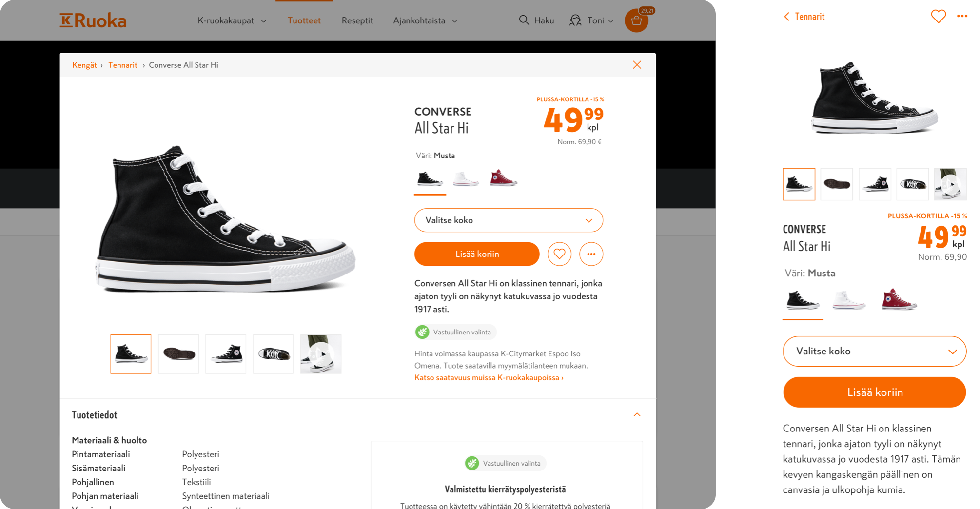
Product card: Utility goods
The utility goods had some additional requirements such as the possibility to change the size and color of shoes or clothes.
Product listing and add to basket interactions
The add to basket function was re-designed so that the user would see which items they would already have in the basket just by noticing the subtle change in the background color. The microinteractions were also tweaked and a delete trash can added for quickly deleting items from your basket.

Footer
The site didn't have a footer, so one had to be designed to represent the site map and to have an extra navigational element for the users.
